Moving melbcoffee.com from Vercel to Cloudflare
Porting melbcoffee.com from Next.js on Vercel to a static Astro site on Cloudflare, splitting it into English and Japanese with machine translations, and testing how well Fable 5.2 follows a UI/UX skill
On this page
melbcoffee.com is a coffee diary that my partner Tomoyo and I keep of our favourite cafes around Melbourne. Like this blog, it ran on Next.js and Vercel. As of today, it is a static Astro site served by a Cloudflare Worker.
Yesterday I wrote about moving this blog from Vercel to Cloudflare. The melbcoffee.com move followed the same plan, so this post focuses on what was different. It came in three parts:
- Moving from a Next.js app with a database to a static site.
- Giving every page its own language, English or Japanese, with machine translations filling the gaps.
- A redesign by Fable 5.2. I mostly wanted to test how well it follows my UI/UX skill while keeping to the site's existing look.
Why it moved
The short answer is the same as for the blog. The Next.js app went over Vercel's free plan, and the site went down.
The longer answer is that the old site was far bigger than it needed to be. I last changed it in March 2024, and it had:
- A Turborepo with a Next.js 14 app, Prisma and Postgres, tRPC and NextAuth.
- A homemade CMS with sign-in and a dashboard for writing posts.
- A separate
/jpversion of the site. Only the menus and buttons were in Japanese, and the posts were still in English.
That is a lot of moving parts for a site that publishes a new cafe review every now and then. None of the pages change between visits, so they can be built once and served as files.
What we moved to
The new site works the same way as the blog. Astro builds every page ahead of time, and one Worker serves the results as static files. The only code that runs on a request is the newsletter sign-up.
| Area | Old site | New site |
|---|---|---|
| Framework | Next.js 14 in a Turborepo | Astro, fully static |
| Posts | Postgres through Prisma, written in a CMS | MDX and JSON files in the repository |
| Hosting | Vercel (Hobby) | Cloudflare Workers static assets |
| Newsletter | User accounts in Postgres | Effect Worker and D1 |
| Infrastructure | Vercel dashboard | Alchemy |
| Domain | Registered through Vercel | Registered with Cloudflare |
| Photos | S3 and a CloudFront resizer | Unchanged |
What we kept and what we removed
Most of the old code is gone. What we removed:
- Next.js, the Turborepo, Prisma and Postgres, tRPC and NextAuth.
- The CMS, sign-in and dashboard.
- The "We are open" and stats pages, and the sponsorships section.
- The email link in the footer. The domain has no mail server, so emails sent to it bounced.
What we kept:
- Every post, cafe and gallery photo, moved out of the database and into files.
- The logo, colours and fonts.
- Every URL. Old addresses such as
/en/...,/post/...,/openand/loginredirect to their new home. - The photos. They stay in an S3 bucket behind a CloudFront resizer, which serves each photo at the width a page asks for. That is now the only part of the site on AWS.
The new site's only runtime dependencies are Astro (with its MDX and RSS packages), Effect, the Mux video player, node-emoji and lodash-es.
Getting the posts out of Postgres
Unlike the blog, melbcoffee.com kept its posts in a database. A one-off script copied all 52 posts (three of them drafts), the cafes and the gallery from the production database into files.
A second script then compared the new pages with the database. It checked titles, descriptions, every paragraph, tags, photos, cafe names, addresses and the gallery. Only one paragraph needed a hand edit. A bold sentence ended with a Japanese full stop (。) inside the closing **, which Markdown doesn't read as bold. The asterisks had been showing on the old site too.
The newsletter Worker
POST /api/subscribe is an Effect v4 Worker that saves email addresses to D1, like the blog's. It:
- Rejects sign-ups posted from other sites.
- Limits how often one IP address can sign up.
- Rejects requests over 4 KB.
- Keeps email addresses out of the logs.
The form also works with JavaScript turned off. Subscribers from the old site came across from its user accounts that had a verified email.
Two surprises during the switch
- The blog and melbcoffee.com clashed in Cloudflare. Alchemy keeps a record of what it has deployed in a small store inside your Cloudflare account. The blog had already created that store with a newer Alchemy version. When melbcoffee.com deployed with an older version, it tried to replace the store and failed. The fix was to give melbcoffee.com a store of its own, so the two projects can update Alchemy separately.
- Analytics had not been working. Simple Analytics loads its script from an
sa.melbcoffee.comsubdomain, and the DNS record for it was missing on Vercel. The Cloudflare DNS setup is now written in code and includes that record, so analytics work again.
The switch itself was quick. Vercel had already taken the site down, so there was no downtime to avoid. I created the DNS zone on Cloudflare, pointed the domain at it, deployed the site and checked the redirects.
I have since moved the domain registration to Cloudflare as well. On the blog, the domain stayed with AWS because I use plenty of other AWS products there. melbcoffee.com has no reason to register its domain on AWS, so keeping the domain, DNS and hosting in one place made more sense.
English and Japanese
Tomoyo writes her reviews in Japanese and I write mine in English, and many posts have one of each. The old site showed both on the same page.
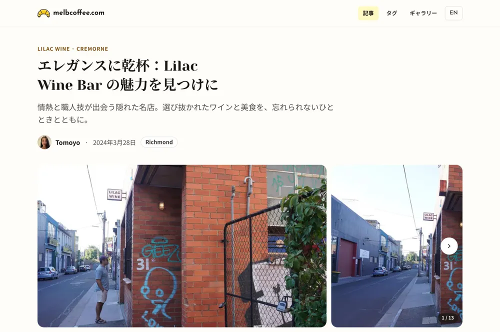
Now every page is built twice. The English page keeps its current URL, and the Japanese page lives under /ja. For example, /posts/lilac-wine-bar is also at /ja/posts/lilac-wine-bar. Each page reads in one language, and the build went from 76 pages to 151.
Which reviews a page shows
Menus, buttons, the newsletter form, dates and distances come from one file, src/lib/i18n.ts, which has an English and a Japanese version of every string.
In a post, each review says which language it is written in:
<ReviewBlock author="tomoyo" heading="魔法の始まり!" lang="ja">
  ...
</ReviewBlock>
A page first shows the reviews written in its own language. After those, it shows machine translations of the rest. So the English page shows my review, then a translation of Tomoyo's, and the Japanese page does the opposite.
The translations live in their own folder, one file per post and language:
translations/ja/<slug>.mdxhas the Japanese title, description and cafe name, and Japanese translations of the English reviews. Every post has one.translations/en/<slug>.mdxhas English translations of the Japanese reviews. Only posts with a Japanese review need one.
Each translated review is labelled, for example "Translated from Japanese. Read the original", with a link to the original review on the other language's page. All 50 published posts were translated, which came to 96 files.
Keeping translations up to date
Machine translations saved as files can quietly go out of date when someone edits a post. To catch that, each translation file stores a short fingerprint (a hash) of the text it was translated from:
---
title: "コリングウッドの Into Coffee で、ゼロウェイストに夢中"
description: "..."
name: "ゼロウェイスト・カフェ"
source: 3d98ebdb89d5
---
pnpm check:translations works out the fingerprint of every post again. It fails if a translation is missing, or if a post has changed since it was translated. CI runs this check on every pull request. Updating a translation takes two commands:
node scripts/translations.ts source ja/<slug>   # prints the text to translate
node scripts/translations.ts stamp ja/<slug>    # marks the translation as up to date
Smaller details
- Old
/jp/...links redirect to/ja/..., and/en/...links redirect to the English page. - Every page tells search engines its language and where the other language's version is, and the sitemap lists both.
- Signing up for the newsletter from a Japanese page lands on a Japanese confirmation page, even without JavaScript.
- The translation work turned up a few mistakes, which are now fixed. Three of Tomoyo's Japanese reviews had English headings, one review showed my photo instead of hers, and one post had another post's description.
- A script checked every English page for Japanese text and found none. On Japanese pages, the only English left is names and street addresses.
- Link previews on social media stay in English for both languages, because the font on those images has no Japanese characters.
The redesign with Fable 5.2
The move to Astro came with small visual tweaks, but the pages still looked much like the old site. I wanted a proper redesign. I also wanted to see how well Fable 5.2 would follow my UI/UX skill on a real site that already had a look of its own.
The skill's main rule is that the project's existing look always wins. Before writing any code, it lists the colours, fonts, spacing and components the project already has, and it must use those instead of its own. It then works through a set of design principles: how the page is organised, spacing, what stands out most, how things respond when you use them, and who is using the page. Along the way it keeps buttons and links at least 44px tall on phones, limits animations to a few short timings, and checks the result at desktop and phone sizes.
I asked for a redesign of the home page and the post page, in both languages, with the other pages tidied to match.
What it produced
Along with the pull request, it shared a page of before and after screenshots. They showed the new code running on desktop and phone, in both languages. The page also listed three decisions for me to confirm: keeping only one newsletter sign-up, showing less of the date, and building on top of the language work. I could review the design from the screenshots without reading the code.
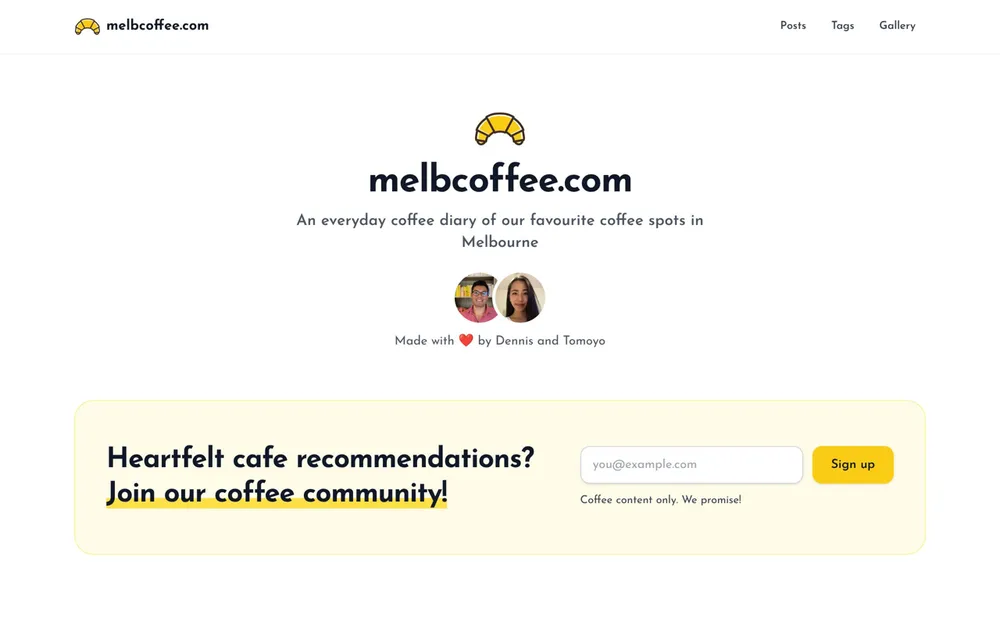
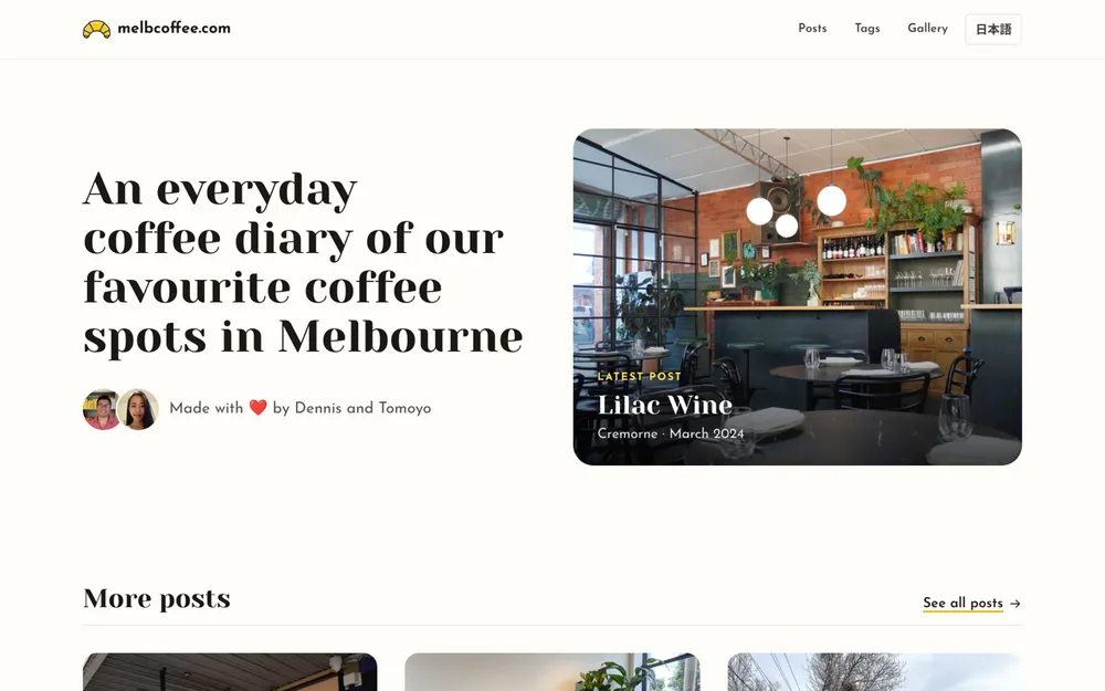
The home page changes:
- The tagline sits next to the photo from the latest post, instead of a centred logo.
- Post cards have no borders. Each shows a photo, the suburb, the cafe name, one line about it and the month.
- A "Browse by tag" list sits under the posts.
- There is one newsletter sign-up in croissant yellow, where there used to be two.
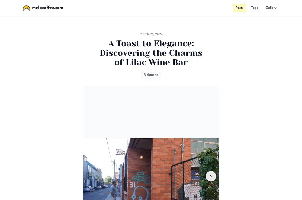
The post page changes:
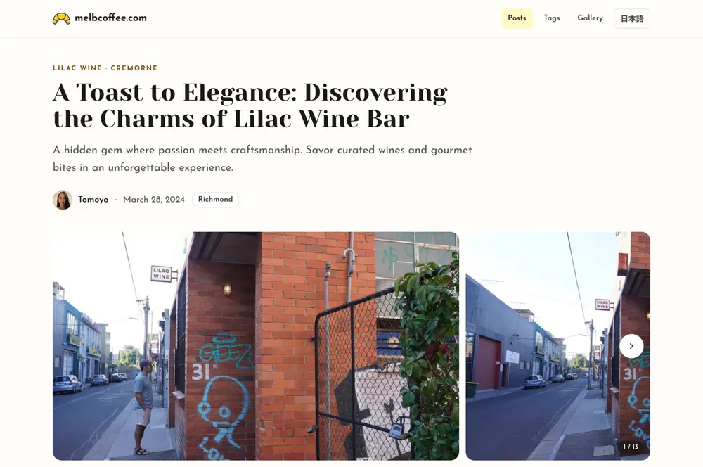
- The top of the page shows the cafe and suburb, the title, a summary, who reviewed it, the date and tags, all aligned left.
- The photos sit in one scrolling strip with a counter, instead of a slideshow with a row of thumbnails. Repeated photos only appear once.
- Reviews are no longer in boxes, and the reviewer's name sits next to the heading.
- On desktop, the cafe's address, links and map sit next to the review and stay on screen as you scroll. On a phone, tapping the address near the top jumps down to them.
- Nearby cafes use the same photo cards as the home page, with their distance.
The Japanese pages got their own typography. They use the Japanese fonts already on the reader's device, a more traditional serif style (Mincho) for headings, and more space between lines. Headings also break between phrases rather than in the middle of a word.
How well did it keep to the existing look?
This is what I most wanted to find out.
- The brand didn't change. The logo, the Yeseva One and Josefin Sans fonts, and the croissant yellow are all the same.
- It changed the existing colours instead of adding new ones. The site defines its colours in one place. The redesign warmed up the greys there, added an off-white "paper" background, and removed the blue. Links are now dark text with a yellow underline instead of blue. Animations reuse the site's existing timing and stay short.
- It told me what it changed. The skill asks for any change to the site's colours or styles to be called out. The pull request listed the colour changes, the text it removed and the new interface strings.
- It checked its own work. The pull request reports that no page scrolls sideways at any width from 320px to 1920px in either language, that all text passed a contrast check, and that buttons and links are at least 44px tall on phones.
- It fixed small bugs along the way. Four rating emoji that hadn't been showing now appear. Post styles no longer leak into the boxes inside a post. The old post page no longer scrolls sideways.
Changing the greys does mean it edited the site's colours rather than only using them. That was part of what a redesign is for, and the pull request said so up front.
Performance
I measured three versions of the site with Lighthouse on a simulated phone: the old Next.js site, the Astro site straight after the move, and the Astro site after the redesign. All three ran on the same machine, each page was measured five times, and the tables show the middle result.
Lighthouse performance score
| Page | Old site | After the move | After the redesign |
|---|---|---|---|
| Home | 81 | 100 | 98 |
| A post | 73 | 95 | 97 |
| All posts | 78 | 97 | 97 |
| Gallery | 90 | 100 | 99 |
Largest Contentful Paint (how long the biggest thing on screen takes to appear)
| Page | Old site | After the move | After the redesign |
|---|---|---|---|
| Home | 4.7s | 1.5s | 2.5s |
| A post | 5.3s | 2.9s | 2.6s |
| All posts | 5.3s | 2.6s | 2.6s |
| Gallery | 3.2s | 1.8s | 1.8s |
Total Blocking Time (how long the page is too busy running JavaScript to respond to a tap)
| Page | Old site | After the move | After the redesign |
|---|---|---|---|
| Home | 171 ms | 0 ms | 12 ms |
| A post | 340 ms | 47 ms | 16 ms |
| All posts | 167 ms | 0 ms | 0 ms |
| Gallery | 174 ms | 0 ms | 0 ms |
What a first visit downloads
| Page | Old site | After the redesign |
|---|---|---|
| Home | 680 KB in 50 requests, 346 KB of it JavaScript | 372 KB in 17 requests, no JavaScript files |
| A post | 522 KB in 47 requests, 419 KB of it JavaScript | 304 KB in 18 requests, no JavaScript files |
| All posts | 668 KB in 49 requests, 336 KB of it JavaScript | 416 KB in 16 requests, no JavaScript files |
| Gallery | 707 KB in 56 requests, 347 KB of it JavaScript | 169 KB in 20 requests, no JavaScript files |
A few things stand out:
- The move did most of the work. Every page lost all of its framework JavaScript, and the time before the main content appears roughly halved.
- The redesign kept the scores between 97 and 99. The home page is the one place it gave something back. It now opens with a large photo of the latest cafe, so that photo is the biggest thing on screen, and it takes about a second longer to appear than the text that used to be there.
- The old post page also scored 54 for accessibility and 82 for SEO. Every page I measured on the new site scores 100 for both.
"No JavaScript files" means the pages load no framework JavaScript. A few small scripts are written inline in the page, and the analytics script was blocked in these runs. The fonts (Yeseva One and Josefin Sans) are cut down to only the characters the site uses, which took a page's fonts from 39 KB to 20 KB. Maps and the Mux video player only load when someone clicks them.
What is next
- Confirmation emails for new newsletter sign-ups, so people have to confirm their address before they are added.
- A CI check that reminds me to update the fonts when a post uses a character they don't include yet.